Search Autocomplete — Best Practices
The Search Autocomplete page documents the contract — variables, annotation attributes, keyboard modes. This page is about what a good dropdown looks like and how the better shop templates build it. It exists so that every shop's ajax/search.tpl can be reviewed against one standard; the review checklist at the end is the audit form.
The examples come from four production layouts, referred to by what they sell:
- Garden machinery — a multi-country shop with a large spare-parts catalogue and a magazine
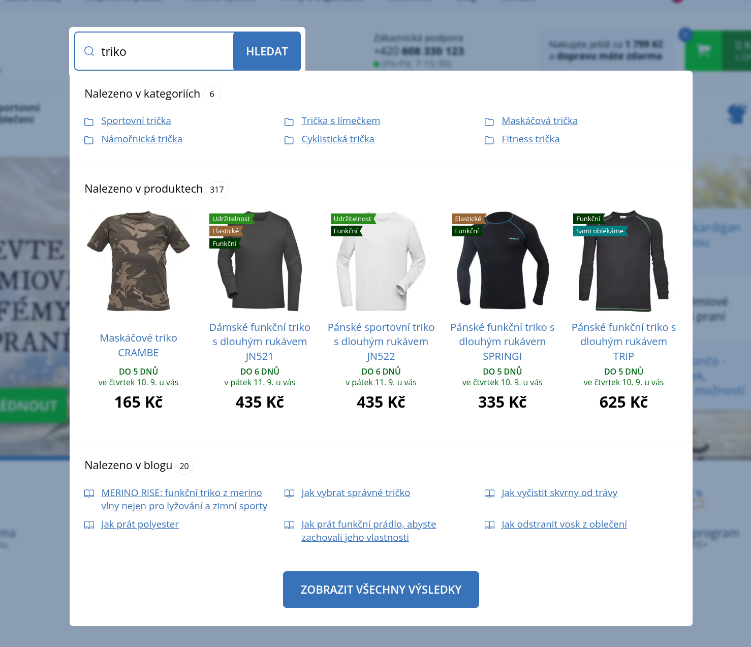
- Workwear — a textile shop with product labels and delivery-date promises
- Fishing gear — a shop with brands, articles and product ratings
- Fashion shoes — a shoe and handbag shop with strong brands, sale subtrees that duplicate category names, and a handful of old articles
None of them is perfect; where one gets something wrong it is called out, because the same mistake is probably in other templates too.
The dropdown has three states
The search field is the highest-intent element on the page: a customer who types is telling you what they want to buy. The dropdown has to answer well in all three states the template renders, not only the second one:
| State | Condition in ajax/search.tpl | What the customer expects |
|---|---|---|
| Default panel | q is empty (focus on an empty field, or fewer than 3 characters) | Something worth clicking before they type: popular categories, personal recommendations, recently viewed |
| Results | q set, at least one collection non-empty | Categories, products, articles, pages — each visibly distinct, phrase highlighted, a way to the full listing |
| Nothing found | q set, every collection empty | A clear message and a way forward (advice, contact) — never an empty box, and never products that look like results |
A template that handles only the results state throws away the first and the last interaction of every search.
1. The default panel — use it
When the field is focused and empty, the dropdown is a free merchandising surface in the most visible spot of the page. Show it. Do not leave the customer staring at an empty input.
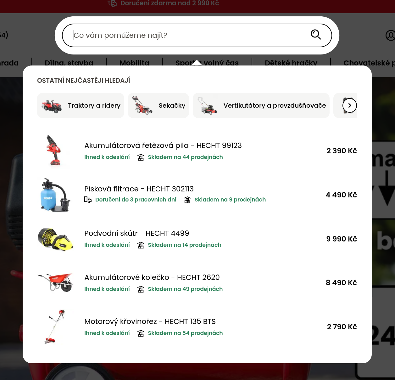
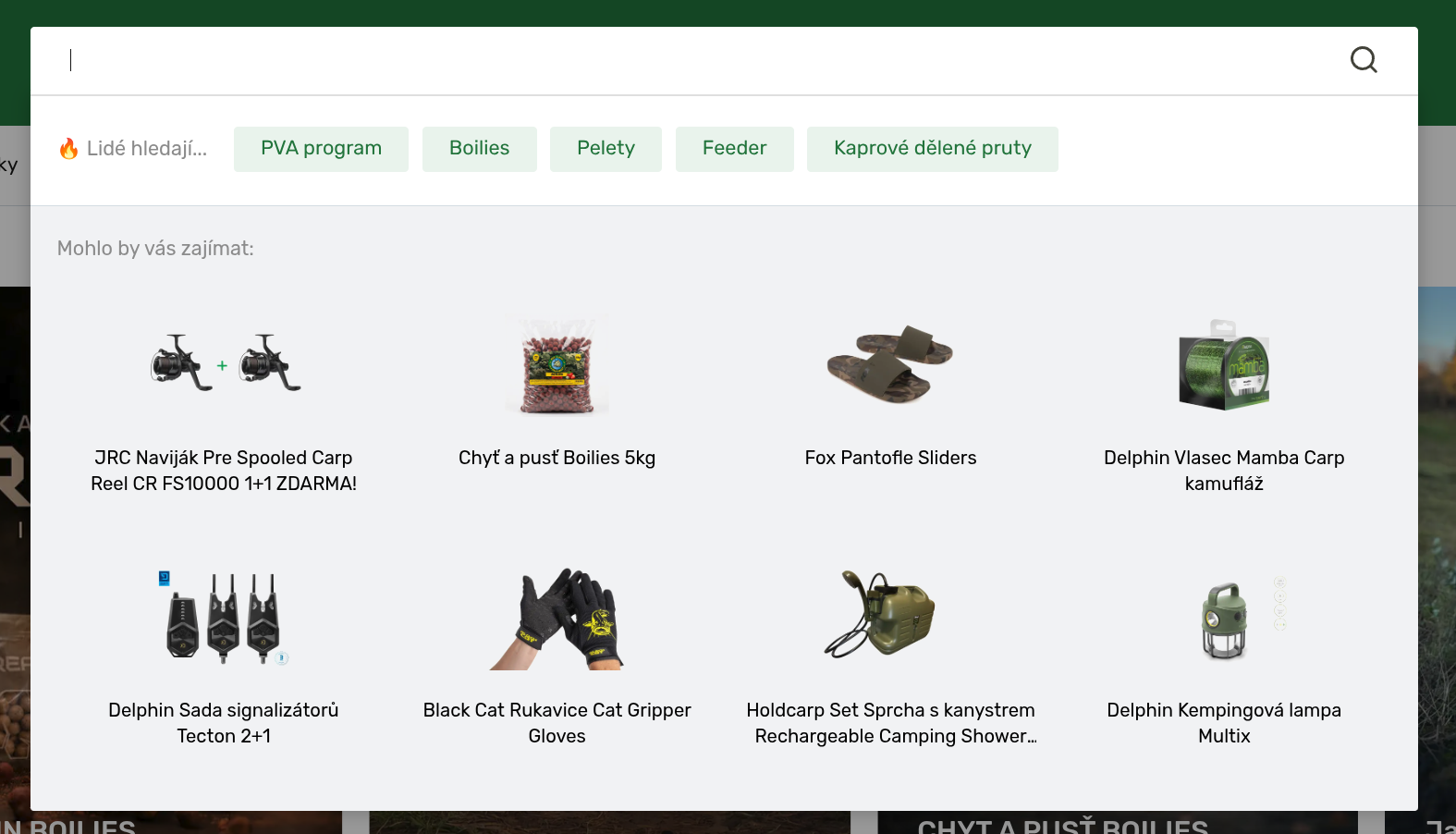
How it opens
Set min-length="0" on the form. The shared script then requests /_search_html on focus with an empty phrase, the presenter blanks anything under 3 characters, and your template renders its q is empty branch:
<i:search-form autocomplete=".site-search" min-length="0" class="form-search" role="search">
    <label for="role:search" class="hide">{% trans 'Hledaná fráze' %}</label>
    <input data-role="search" placeholder="{% trans 'Co vám pomůžeme najít?' %}" data-testid="global-search-input">
    <button data-role="submit">{% trans 'Hledat' %}</button>
</i:search-form>
<div class="site-search" data-testid="global-search-results"></div>
The autocomplete attribute value is the CSS selector of the element the fragment is inserted into (default .global-autocomplete). Both layouts with a default panel use this form. min-length accepts a single digit only.
Keep min-length at 0
With the default min-length="3" the panel only opens once the customer has typed three characters, so the default panel is never requested and never shown — unless the container already holds pre-rendered content, which the script then reveals on focus. Rendering it through the ajax template with min-length="0" is simpler and keeps one file in charge of the dropdown.
What to put there
Pick two or three of these, in this order of value:
Personal recommendations — the recsys homepage slate is the natural content: it is personalised per visitor (recently viewed store, person hash) and it is measured. Render it through
i:list-container; templates underajax/are exempt from thei:dynamic lazyrule because the dropdown is the deferred fetch.twig{% if q is empty %} <p class="site-search__head">{% trans 'Mohlo by vás zajímat' %}</p> <i:list-container type="product" source="{'recommendHomepage': true, 'limit': 8}" name="listfeedsearch" hide-empty> <div data-role="list" class="site-search__tiles"></div> </i:list-container> {% endif %}limitis the number of tiles you show (max 20); an untrained shop or an outage yields an empty slate andhide-emptyremoves the block. See Listings — recommendations.Recently viewed products —
repository.productwithviewed: true. The fishing-gear layout shows these when they exist and falls back to a promo listing otherwise:twig{% if repository.product.findBy({'limit': 1, 'viewed': true})|length >= 1 %} <p>{% trans 'Naposledy jste prohlíželi' %}</p> <i:list-container type="product" source="{'limit': 8, 'viewed': true}" name="listfeedsearch" hide-empty> <div data-role="list"></div> </i:list-container> {% else %} …recommendations… {% endif %}Popular searches / entry categories — a short row of chips or tiles the shop manages itself, so marketing can rotate it without a template change. Two admin-managed sources exist:
- Template attributes (
config.json): the garden-machinery layout definesajax_search_categories(typecategory, multiple) andajax_search_products(typeproduct_list) in a "Vyhledávání" group and readsthis.templateAttributes.ajax_search_categoriesin the template. - Content grid: the fishing-gear layout reads categories, brands, products, articles and free links from a
recommendationsrow of a shared footer grid. A dedicated grid file (e.g.content-grid/search.xml) with acategory/product/urlrow is the cleaner variant.
Label the row honestly — "Ostatní nejčastěji hledají" / "Lidé hledají" tells the customer why these are here.
- Template attributes (
Two things to check
- Queries belong inside the branch that renders them. The template renders on every focus, so a
repository.product.findBy({'search': q, …})placed above theq is emptycheck runs with an empty phrase on every focus for nothing. The garden-machinery layout has all four search queries before the state check — move them into theelse. - Default-panel clicks are not in the search click-stream. The search beacon only fires for phrases of 3+ characters, so a plain
<a>in the default panel is invisible to the „Vyhledávání" report. Products rendered throughi:list-containerare measured by the listing beacon instead (the container carries the list identity) — which is why the recsys slate and the recently-viewed list should go through a list container rather than a hand-written loop. Chips linking to categories are the one thing you cannot measure here; keep them few.
2. Results — what to search and how to lay it out
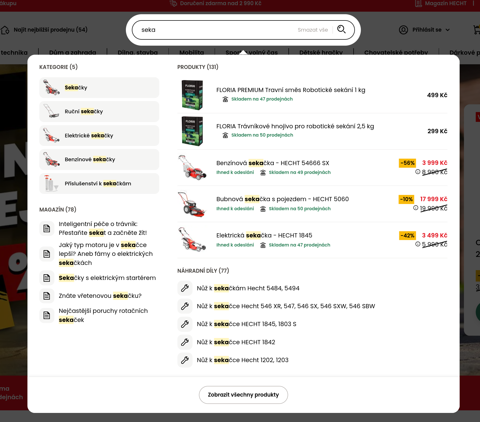
Search everything the shop has
The repositories search five entity types; a dropdown that only lists products makes the customer scroll past twenty lawnmowers to find the "Sekačky" category that would have answered in one click.
{% set categories = repository.category.findBy({'search': q, 'limit': 5}) %}
{% set brands     = repository.brand.findBy({'search': q, 'limit': 5}) %}
{% set products   = repository.product.findBy({'search': q, 'limit': 5}) %}
{% set articles   = repository.article.findBy({'search': q, 'limit': 5}) %}
{% set pages = repository.textPage.findBy({'search': q, 'limit': 3}) %}| Type | Why it belongs in the dropdown | Who does it |
|---|---|---|
| Categories | The best answer to a generic phrase ("triko", "seka"). Name-first matching with inflection and typo tolerance, so every hit is explainable by its visible name. | all three |
| Products | The direct hits; the only type where price and availability matter. | all three |
| Brands | Brand phrases are common; a brand tile beats five random products of that brand. | workwear, fishing gear |
| Articles | Advice content ("jak vybrat správné tričko") turns a research query into a visit instead of a bounce. | all three |
| Text pages | Service questions typed into search: "vrácení", "reklamace", "doprava". Only pages flagged zobrazovat ve vyhledávání are returned — check that the shop flagged them, otherwise the section stays empty. | none yet — add it |
A shop can add its own sections when the catalog has a natural split. The garden-machinery layout runs two product queries — the catalog without the spare-parts category (skipCategory) and spare parts only (category + subcategories) — and renders the parts as a compact "Náhradní díly" list with a wrench icon. Mirror the shop's own navigation, not the repository's type list.
Order and size
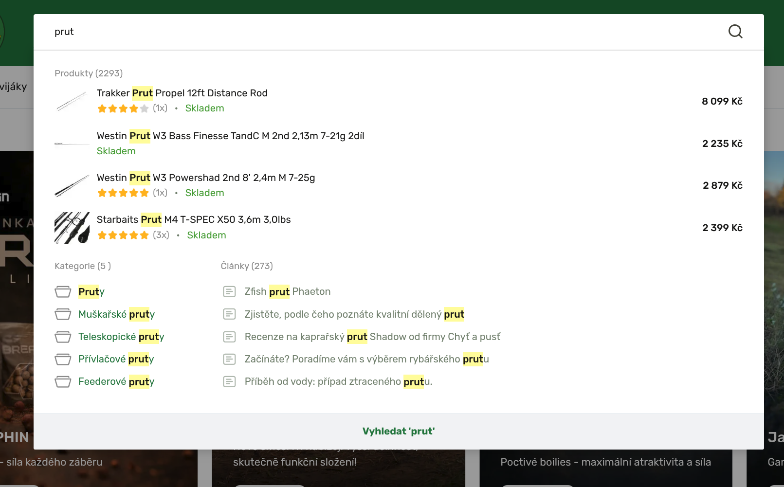
- Categories (and brands) first, then products, then articles and pages. Categories narrow intent in one click; putting them after five products (fishing gear) buries them.
- Around 10 items on desktop, 4–8 on mobile. Five products, five categories, three to five articles is plenty. More rows do not get more clicks — the click-position histogram in the „Vyhledávání" report has a fat tail past position 10 that reads as customers hunting, not finding.
- Put the count in the heading — "Produkty (131)", "Nalezeno v kategoriích 6" — from
products.totalCount. It tells the customer whether to click a result or go to the listing. - Distinguish the types visually — by shape first: chips for categories, cards for products, plain links for articles and pages, a section heading over each. An icon per type (folder, document, wrench) also works, but grey folder and document icons read as a file manager; in a fashion shop the icon rows looked like a generic search widget dropped into the page, and the shape-based version needed none.
- Two categories can share a name. Sale and campaign subtrees mirror the catalogue ("Kabelky a tašky" under "Mid Season Sale"), and the repository returns both. Rendering the name as-is then shows two identical rows. Append the parent only when a name appears twice in the collection, so the common case stays short.
Three layouts that work:
- Two-column desktop (garden machinery): categories + articles on the left, products + spare parts on the right, one column on mobile. Uses the width of a wide search field well.
- Single column with tiles (workwear): categories as a link grid, products as five real product cards with labels, delivery date and price, articles as links. Cards reuse the listing look, which the customer already knows.
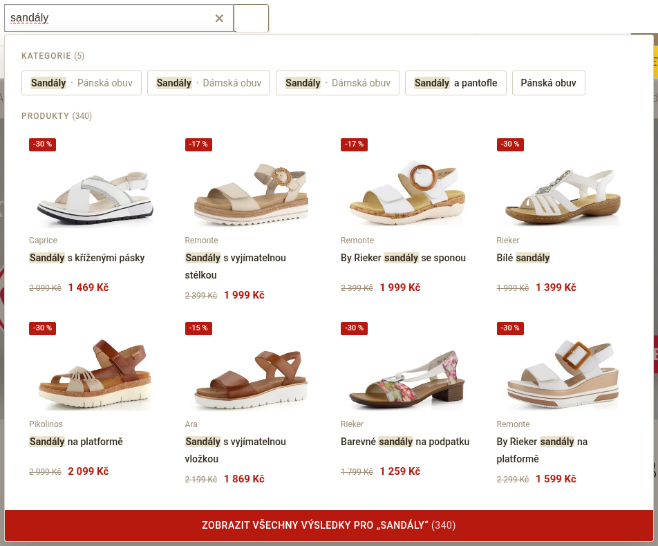
- Chips, then card rows (fashion shoes): category chips on the first line, eight product cards in two rows of four, then brands, articles and pages as compact labelled rows under a rule; one column of product rows on phones. Reads top to bottom in the order that answers a generic phrase, and never leaves a short sidebar next to a tall column.
Product rows
A product row needs, in this order: image, name with the phrase highlighted, availability, price. Discounts belong on the row (garden machinery: "-56 %" badge, crossed-out original price, the 30-day-lowest tooltip). Ratings help when the shop has them (fishing gear shows stars and count).
Two refinements from the fashion-shoes layout:
- Brand on its own line. Where the brand is the first thing a customer scans (fashion, cosmetics, tools), print
product.brand.nameas a small muted line above the name — and strip the brand from the start of the name so it does not appear twice ("Ara pánské polobotky" becomes Ara over Pánské polobotky). - Availability only when it is information. If nearly everything is in stock, "Skladem" on every row is noise. Print the availability text only when the product has a wait (
product.item.availability.hours > 0); the absence of a line then means "in stock".
Images
Thumbnails are generated on demand and cached per variant. A format the layout has not used before means generating a new thumbnail for every product the dropdown ever shows, and the first customers wait for it. So:
- Reuse a format the layout already emits — usually the listing's product format (
300x300,330x250, …); category tiles take the menu's category format, brand logos the brands page's. A thumbnail slightly larger than the rendered box is fine, the CSS scales it down. - The variant key is width × height plus the
fillflag and quality.format="300x300"andformat="300x300" fillare two different files.fillpads the image to the exact box with white, it does not crop, so it is safe for logos. - No lazy loading in the dropdown. The fragment is inserted in reaction to focus or typing and is always inside the viewport when it appears, so
lazyload,auto-lazyloadandloading="lazy"only delay the decode when the panel scrolls on a phone. Templates underajax/are the one place where the layout's lazy-image convention does not apply (the same exemption they already have from thei:dynamic lazyrule).
Never call a repository inside a result row
The template renders on every keystroke. The garden-machinery product row loops over repository.store.findBy(…) and asks availableAmountInShowroom(store) for each store, for each product — that is 5 × N store queries per keystroke to print "Skladem na 44 prodejnách". Precompute such data outside the loop, or use the availability object the product already carries.
The workwear layout fetches the products twice — once into products for the count and again inline in the for — replace the second call with the variable.
Highlight the phrase
Use the highlight filter on names of every type — products, categories, articles, pages:
<span class="site-search__name">{{ product.name|highlight(q) }}</span>It wraps every case-insensitive occurrence of the phrase in <span class="global-highlight-search">…</span>; style that class (yellow background is the convention, see the screenshots). Two limits to know:
- It is a literal substring match: "sekacka" does not highlight Sekačka, and "sekačka trávy" highlights only rows containing that exact sequence. Names that matched by inflection or typo tolerance render unhighlighted — that is acceptable; do not try to be cleverer than the filter.
- Apply it to plain names only. Rich HTML values (
HtmlString) are returned unchanged.
The workwear layout renders names without highlight — add it; a highlighted match is what lets the eye jump to the right row.
Always end with the show-all row
The last item is a link to the full listing, always rendered, annotated data-result-type="more":
<a href="{{ searchPageUrl }}" data-result-type="more" class="site-search__all">
    {% trans 'Zobrazit všechny výsledky' %} ({{ products.totalCount }})
</a>
searchPageUrl is built by the platform and carries vypis=1, which guarantees the listing (and not a category or brand redirect for single-entity phrases). Do not assemble the URL by hand. Two good labels: "Zobrazit všechny výsledky (317)" with the count, or the fishing-gear layout's "Vyhledat 'prut'" repeating the phrase.
The second, reranked response
On every shop the platform may deliver a second response ~350 ms after the first for phrases of 5+ characters — the same template rendered with a better-ranked hit list. The script swaps the fragment and fires autocomplete:loaded again. Consequences:
Anything you initialise in the fragment (a Swiper slider for category tiles, tooltips) must be initialised in an
autocomplete:loadedhandler, not once on page load — the garden-machinery layout does exactly this:js$(document).on('autocomplete:loaded', '.form-search', function () { customSlider(); });Do not animate rows in; a swap that re-plays an entrance animation looks like a glitch.
3. Nothing found — say so and offer a way out
Render an explicit message the moment every collection is empty, and give the customer a way forward in words: shorten the phrase, check the spelling, try a broader term, or ask the shop. The two better patterns:
- Fashion shoes: a two-column panel — "Bohužel jsme nic nenašli pro „q“." with admin-editable advice (template attribute
search_empty_page, default "Zkuste dotaz zkrátit, zkontrolovat překlepy nebo použít obecnější výraz.") on the left, customer support (phone, e-mail, a link to the contact page) on the right. Nothing below it. - Fishing gear: an admin-editable text (template attribute
page_empty_search) with a default that links to the contact page: "Pokud hledáte konkrétní věc a nenacházíte, kontaktujte nás. Najdeme to za vás, nebo poradíme alternativu."
No product strip under the message
Do not fill the space under the message with products — not the recsys recommendHomepage slate, not a template-attribute pick, not bestsellers. The customer has just typed a phrase, so everything in the dropdown is read as an answer to that phrase. A recommendation slate is chosen from the visitor's history, not from the phrase, and rendered as product cards it looks exactly like the results state: "boty červené" answered with a pair of sandals, a brown handbag and a silk scarf reads as a search that returns nonsense, not as a shop being helpful. The first version of the fashion-shoes layout shipped exactly this strip ("Mohlo by vás zajímat") and it had to be removed; the workwear layout's "Mohlo by se Vám líbit" strip is the same mistake with a hand-picked list.
Recommendations belong in the default panel, where there is no phrase for them to contradict.
Check the condition covers every collection you render
The fishing-gear layout decides "nothing found" from categories, products and brands — but it also queries and renders articles. A phrase that matches only an article shows the "nic jsme nenašli" panel while an article exists. Whatever you fetch goes into the emptiness check.
The same applies to a list you derive from a collection. The fashion-shoes layout skips articles older than two years (a 2013 post next to the products reads as a neglected shop) — the emptiness check then has to use the filtered list, otherwise a phrase whose only hits are old articles renders an empty results panel instead of the message.
4. Tracking — make every click count
Every terminated search interaction is logged by the shared script through one beacon to /_rum/frontend-fulltext-search-log and lands in the shop's „Vyhledávání" report (/admin/analytika/r/fulltext): found rate, top phrases, zero-result phrases, click positions, device split. A template contributes to that report only if it is annotated; nothing else is needed, and nothing else can substitute for it.
| Outcome | Logged when |
|---|---|
success | a result link was clicked or opened with Enter — carries the result type, its rank, the URL and the product id |
direct | the form was submitted to the full listing after a response had arrived |
abandoned | the dropdown was closed while it showed results |
empty | the dropdown was closed with zero results |
skip | the form was submitted before any response arrived |
What the template must do
- Annotate every result with
data-result-type—product,category,brand,article,page,more. Use the vocabulary exactly: the garden-machinery spare-parts macro labels an itemarticlewhen it has a topic andproductotherwise, which is right; a template that labels articles asbrandsilently corrupts the report. - Put
data-product-idon product results. Without it the click is logged, but the „Klikané produkty" tab cannot name the product. The workwear layout omits it — every product click on that shop is anonymous. - Use section mode —
data-search-section="N"on each section wrapper — for new and reworked templates (the fishing-gear layout does). Legacytabindexnumbering works, but it is where real shops lose data:- Six storefronts of one multi-country layout logged not a single result click for months because the number sat on the
<li>above the annotated<a>, a shape the script did not walk up to at the time. The script now handles it, but hand-maintained counters still break on the next template edit. - The garden-machinery price tooltip is a
<span tabindex="4">inside the product link — a decorative tab stop that becomes a keyboard target which highlights nothing and does nothing on Enter. Keeptabindexoff everything that is not a result.
- Six storefronts of one multi-country layout logged not a single result click for months because the number sat on the
- Keep
data-result-typeinajax/search.tplitself. The presenter decides whether the shop's dropdown is "tagged" by scanning that file — even when the form uses a customtemplate="…". A shop whose annotations live only in a differently named file sends no beacons at all. - One click handler per link is automatic — the image link and the title link of a product card may both carry the type; they count as one item for the keyboard and both report the click.
Verify it on the shop
Open DevTools → Network, type a phrase of 3+ characters, click a result, and look for the frontend-fulltext-search-log beacon (filter by that name, check "Preserve log"). Its payload must show status: "success", the right result_type, a result_index_total that matches the visual position, and a numeric product_id for products. Also confirm the _search_html response ends with <!-- tagged-search-results --> — without that comment no beacon is sent. Do this once per shop after any change to the search template; the report cannot tell a shop with no searches from a shop with an unannotated template.
Not on a tpltest domain
The script sends no beacon at all from any simpliashop.cz hostname, so on *-tpltest.simpliashop.cz the beacon never appears in DevTools and the shop's „Vyhledávání" report and search log show nothing for the test domain. Verify the beacon on the production hostname (a dev environment on *.simplia.net also sends it). What the test domain does record is the plain access log — every /_search_html request with its phrase and status — which is enough to see whether the browser sent a request at all.
5. Layout and interaction details
Container and overlay
The script toggles search-open on <body> while the dropdown is visible. Use it for the page treatment behind the panel: the garden-machinery layout darkens the page with an overlay (.search-open .overflow--search), the workwear layout blurs it (.blured, .search-open). Both make the dropdown read as a modal layer, which it is.
Anchor the container to the field and bound it by the header: its left edge on the field's left edge, its right edge no further than the header's right edge (or the viewport's on a phone), with a max height and its own scrollbar so a long dropdown never pushes the page. A panel wider than the field is fine — a fixed width is not. The fashion-shoes layout shipped a fixed 940px panel that ran 64px past the right edge of an iPad in portrait; it now spans from the field to the header's edge, capped at 940px.
Budget the height as well as the item count. A results panel around 500–700px tall on desktop (one or two rows of cards) leaves the page visible behind the overlay; the first fashion-shoes version was 820px with a short sidebar next to two card rows and a hole bottom-left, and covered the whole hero.
Breakpoints
Layouts define their own $breakpoints map, and it is rarely Foundation's default. The fashion-shoes layout has medium at 580px and large at 720px, so rules written for "desktop" at large applied on tablets and the panel overflowed. Before writing a responsive rule, read css/_settings.scss (or wherever the map lives) and the layout's own visibility helpers (hide-for-tablet-up and friends resolve against the same map), and use the breakpoint at which the header switches to its desktop form. Check the result at three widths at least: a phone (375), an iPad in portrait (1024) and a small tablet or narrow window (about 768) — the last two are where fixed widths and desktop grids break.
Before you redesign: pages to look at
The dropdown borrows its vocabulary from the shop; read these pages first so the panel looks like the shop's own component rather than a generic widget:
- The category listing — the product card (image ratio and background, name, price, discount and label treatment), the filter controls (the size and brand boxes are the natural model for category chips) and the section headings. The dropdown's cards and chips should be recognisable as the same family.
- The header at desktop, iPad portrait and phone — where the field sits, what the panel will cover, whether the header strip is a positioning context you can anchor to, and where the mobile search opens from.
- The product detail — how the brand and availability are presented, so the card repeats that hierarchy.
- The brands page or logo strip, when brand results show logos — it tells you the logo format that already exists and how logos are boxed.
Mobile
The dropdown competes with the on-screen keyboard for viewport. The patterns that hold up:
- Full-width panel under a full-width field; the garden-machinery search field moves to its own row below the logo on small screens.
- A visible back/close control: the garden-machinery layout adds an arrow-left "cancel" button inside the form, the fishing-gear layout a round close button in the corner. The keyboard-only Esc does not exist on a phone.
- Product rows over product cards (a card grid at 2-up leaves four products visible; the workwear layout hides the fifth card below
large). - Big tap targets: one row per result, the whole row is the link.
Keyboard
Arrow keys walk the results (section order in section mode), Enter opens the highlighted item, Esc once hides the dropdown, Esc twice clears the field. Style .search-current-item clearly — a background change on the row, not only an underline. With section mode you get this for free; verify by pressing ↓ a few times on the live shop and watching the highlight follow the visual order (a sidebar that renders first in markup but sits second on screen needs the higher section number).
Field affordances
- Clear button ("Smazat vše") once the field has a value — customers reformulate often (
attempt≥ 2 in the report). - Placeholder that asks a question — "Co vám pomůžeme najít?" beats "Hledat". The fishing-gear layout rotates shop-configured suggestions through a typewriter effect in the placeholder (template attribute
search_suggestions) — a good way to teach what the shop sells. - Submit button stays visible; the form submit is the
directpath to the full listing and must work without JavaScript.
Cost
The fragment renders on every keystroke after a 200 ms debounce, and the endpoint is rate-limited per IP (429 when exceeded). Keep the template to the five findBy calls with small limits, and do not ask for lazy-loaded images (see Images — nothing in the dropdown is off screen when it appears). Anything that costs a query per row multiplies by the number of rows and by every keystroke of every visitor.
6. Testing
Every layout ships a Playwright spec for the dropdown (tests/global/search.spec.js). Use the shared test ids global-search-input and global-search-results on the input and the container so the same spec survives a redesign, and the special phrases %debugSearchAnyResult% / %debugSearchNoResult% so the test does not depend on catalog data (Template Testing — special values):
test('Autocomplete search', async ({page}) => {
    await init(page, await Url.index());
    await page.getByTestId('global-search-input').fill('%debugSearchAnyResult%');
    await page.getByTestId('global-search-input').press('Space');
    await expect(page.getByTestId('global-search-results')).toBeVisible();
    await expect(page.locator('[data-testid="global-search-results"] [data-result-type="product"]').first()).toBeVisible();
});
Add a second test with %debugSearchNoResult% that asserts the nothing-found message, and — when the form has min-length="0" — a third that focuses the empty field and expects the default panel.
Reference implementations compared
| Garden machinery | Workwear | Fishing gear | Fashion shoes | |
|---|---|---|---|---|
| Default panel | ✅ categories slider + hand-picked products (template attributes) | ❌ none (min-length 3) | ✅ content-grid chips + recently viewed / promo products via i:list-container | ✅ template-attribute phrases or top-category chips + recently viewed / recsys via i:list-container |
| Types searched | categories, products, spare parts, articles | categories, brands, products, articles | brands, products, categories, articles | categories, products, brands, articles (≤ 2 years old), text pages |
| Section order | categories → products → articles → parts | categories → brands → products → articles | brands → products → categories → articles | categories → products → brands → articles → pages |
| Highlight | ✅ | ❌ | ✅ | ✅ (shop's gold, not yellow) |
| Counts in headings | ✅ | ✅ | ✅ (brands hidden) | ✅ "Produkty (287)" |
| Product row | image, name, availability + store count, price, discount badge, 30-day-lowest | card: labels, image, name, delivery date, price, discount | image, name, rating, availability/date, price | card: image, brand line, name without the brand, wait only when not in stock, price, discount badge |
| Nothing found | plain sentence | message + contact, but a product strip below it (reads as results, see §3) | ✅ admin-editable text + contact link | ✅ message (admin-editable) + contact, nothing else |
| Show-all row | ✅ | ✅ | ✅ "Vyhledat 'q'" | ✅ "Zobrazit všechny výsledky pro „q" (287)" |
| Tracking mode | legacy tabindex on <li>; decorative tabindex="4" tooltip | legacy tabindex, no data-product-id | ✅ section mode | ✅ section mode |
| Known defects | queries run before the state check; store query per row | double product query; no highlight; no product id; product strip under the nothing-found message | articles missing from the nothing-found condition; categories below products | first version: fixed 940px panel and desktop grid from 580px (layout breakpoints), four new thumbnail formats, lazy images, recsys strip under the nothing-found message |
Review checklist
Use this when auditing a shop's ajax/search.tpl and header form. Every "no" is a task.
Default panel
- [ ] Form has
min-length="0"and the template has aq is emptybranch - [ ] The branch shows recommendations (
recommendHomepagethroughi:list-container), recently viewed, or admin-managed popular categories — at least one - [ ] Products in the panel render through
i:list-container(measured), not a hand loop - [ ] No
searchquery runs before the state check
Results
- [ ] Categories, products, articles searched; brands and text pages where the shop has them
- [ ] Categories (and brands) come before products
- [ ] Section headings carry
totalCount - [ ] ≤ ~10 items on desktop; product rows show image, name, availability, price
- [ ] A category name that appears twice gets its parent
- [ ] Image formats already exist in the layout (listing / menu / brands page); no
lazyload,auto-lazyloadorloading="lazy" - [ ]
highlight(q)on every name;.global-highlight-searchstyled - [ ] Show-all row uses
searchPageUrlanddata-result-type="more" - [ ] No repository call inside a result loop; no collection fetched twice
- [ ] Sliders/tooltips in the fragment initialise on
autocomplete:loaded
Nothing found
- [ ] Explicit message with a way forward in words (advice, contact) — and no product strip under it, recommendations go to the default panel
- [ ] The emptiness condition includes every collection rendered — and every filtered list derived from one
Tracking
- [ ] Every result annotated with the exact
data-result-typevocabulary - [ ]
data-product-idon product results - [ ] Section mode (
data-search-section) — or, in legacy mode, positivetabindexon results only, nothing decorative - [ ] Annotations live in
ajax/search.tpl(not only in a custom-named template) - [ ] Verified in DevTools on the production hostname (tpltest domains send no beacon):
frontend-fulltext-search-logbeacon withstatus: successand a product id; response ends with<!-- tagged-search-results -->
Layout & interaction
- [ ] Design checked against the category listing (card, filter boxes, headings) and the header at desktop, iPad portrait and phone
- [ ]
body.search-openused for overlay/blur - [ ] Container starts at the field's left edge and never runs past the header or viewport — checked at 375, 768 and 1024px against the layout's own
$breakpoints - [ ] Container scrolls internally; fits under the field on mobile with a close control
- [ ]
.search-current-itemstyled; arrow keys follow the visual order - [ ] Clear button and a question-style placeholder
- [ ]
data-testid="global-search-input"/global-search-resultspresent; Playwright spec uses%debugSearchAnyResult%